Note
Go to the end to download the full example code.
Sketch-Map: nonlinear dimensionality reduction#
Sketch-Map [Ceriotti2011] is a nonlinear dimensionality reduction method designed for diverse, high-dimensional data. Unlike PCA, which preserves the directions of largest variance, Sketch-Map preserves intermediate-range pairwise distances by mapping them through sigmoid functions: very short distances are compressed (treated as “the same”), very long distances are saturated (treated as “far apart”), and the optimisation focuses on the range of distances that actually distinguishes points.
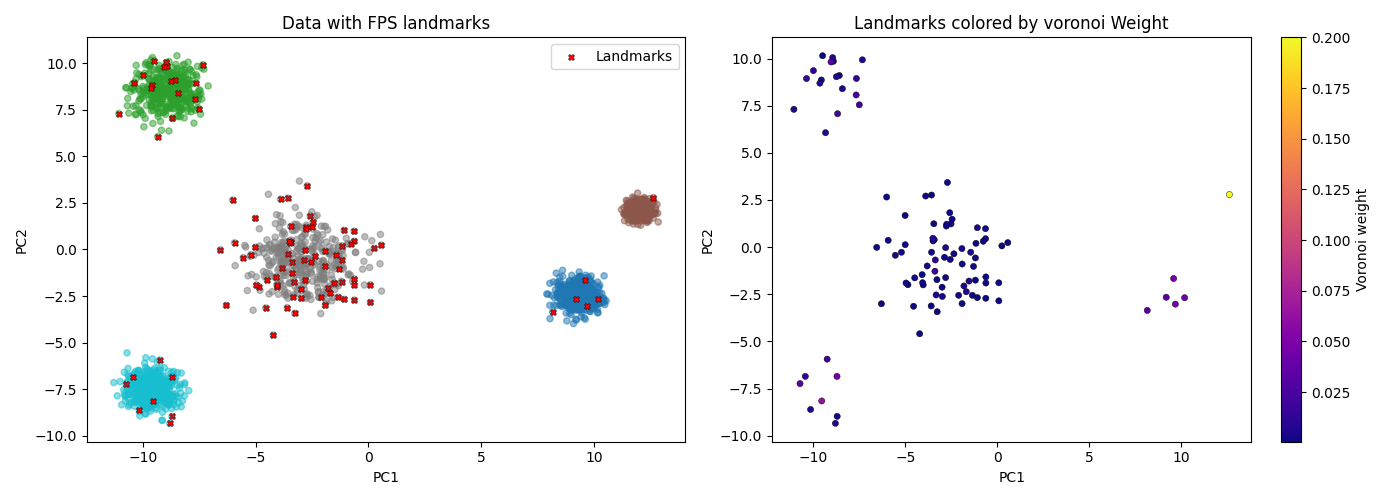
This example shows the standard landmark workflow:
select representative landmarks via Farthest Point Sampling,
weight each landmark by the size of its Voronoi cell,
fit Sketch-Map on the weighted landmarks.
import matplotlib.pyplot as plt
from sklearn.datasets import make_blobs
from sklearn.decomposition import PCA

from skmatter.decomposition import SketchMap
from skmatter.sample_selection import FPS, voronoi_weights
Quick start#
SketchMap() works with no arguments: the sigmoid parameters are estimated
from the pairwise distance distribution of the data it is fitted on, and the
chosen values are reported in params_.
X_blobs, blob_labels = make_blobs(
    n_samples=300, n_features=10, centers=4, cluster_std=0.7, random_state=42
)

sm_quick = SketchMap().fit(X_blobs)

print("estimated parameters:")
for name, value in sm_quick.params_.items():
    print(f"  {name:7s} {value:.3f}")

fig, ax = plt.subplots(figsize=(5.5, 5))
ax.scatter(
    sm_quick.embedding_[:, 0],
    sm_quick.embedding_[:, 1],
    c=blob_labels,
    cmap="tab10",
    s=14,
)
ax.set_aspect("equal")
ax.set_title("Sketch-Map of 10D blobs")
fig.tight_layout()
estimated parameters:
  sigma   2.739
  a_high  5.785
  b_high  2.893
  a_low   2.000
  b_low   2.000
The landmark workflow#
Sketch-Map jointly optimises all pairwise relations, so
SketchMap.fit() scales as \(O(N^2)\) and is meant for up to a few
thousand points. For larger datasets the standard recipe is to fit a small
set of representative landmarks that stand in for the whole dataset.
Landmarks chosen by Farthest Point Sampling are maximally diverse, so on
their own they would misrepresent how dense each region really is. Weighting
each landmark by the number of points in its Voronoi cell
(voronoi_weights(), a density proxy)
restores that information: pairs of landmarks standing for many points
contribute proportionally more to the stress.
Here we draw 2000 points from a 5D blob mixture with deliberately uneven cluster sizes, and fit Sketch-Map on 100 weighted landmarks.
X_full, full_labels = make_blobs(
    n_samples=[800, 600, 300, 200, 100],
    n_features=5,
    cluster_std=[0.5, 0.8, 0.3, 1.2, 0.6],
    random_state=42,
)
fps = FPS(n_to_select=100, random_state=42).fit(X_full)
X_landmarks = X_full[fps.selected_idx_]
landmark_weights = voronoi_weights(X_full, X_landmarks)

sm = SketchMap().fit(X_landmarks, sample_weight=landmark_weights)

fig, ax = plt.subplots(figsize=(5.5, 5))
points = ax.scatter(
    sm.embedding_[:, 0],
    sm.embedding_[:, 1],
    c=landmark_weights,
    cmap="viridis",
    s=60,
)
fig.colorbar(points, ax=ax, label="Voronoi weight")
ax.set_aspect("equal")
ax.set_title("100 Voronoi-weighted landmarks")
fig.tight_layout()
Sketch-Map vs PCA#
Linear PCA captures the directions of largest variance, which on a mixture of clusters of different widths is dominated by the broadest ones. Sketch-Map instead resolves the groups that the intermediate-range distances separate.
pca_emb = PCA(n_components=2).fit_transform(X_landmarks)
landmark_labels = full_labels[fps.selected_idx_]

fig, axes = plt.subplots(1, 2, figsize=(11, 5))
for ax, emb, title in [
    (axes[0], sm.embedding_, "Sketch-Map"),
    (axes[1], pca_emb, "PCA"),
]:
    ax.scatter(emb[:, 0], emb[:, 1], c=landmark_labels, cmap="tab10", s=30)
    ax.set_aspect("equal")
    ax.set_title(title)
fig.tight_layout()
References#
Citation [Ceriotti2011] is listed in the References.